Thursday, 22 January 2015

Task 1b – Primary Research (Practical)

For this task, we had to develop our research on locations and re-shoot. We had to select 1 inanimate object and visit the same indoors and outdoors locations again and re-shoot making the object fit in.

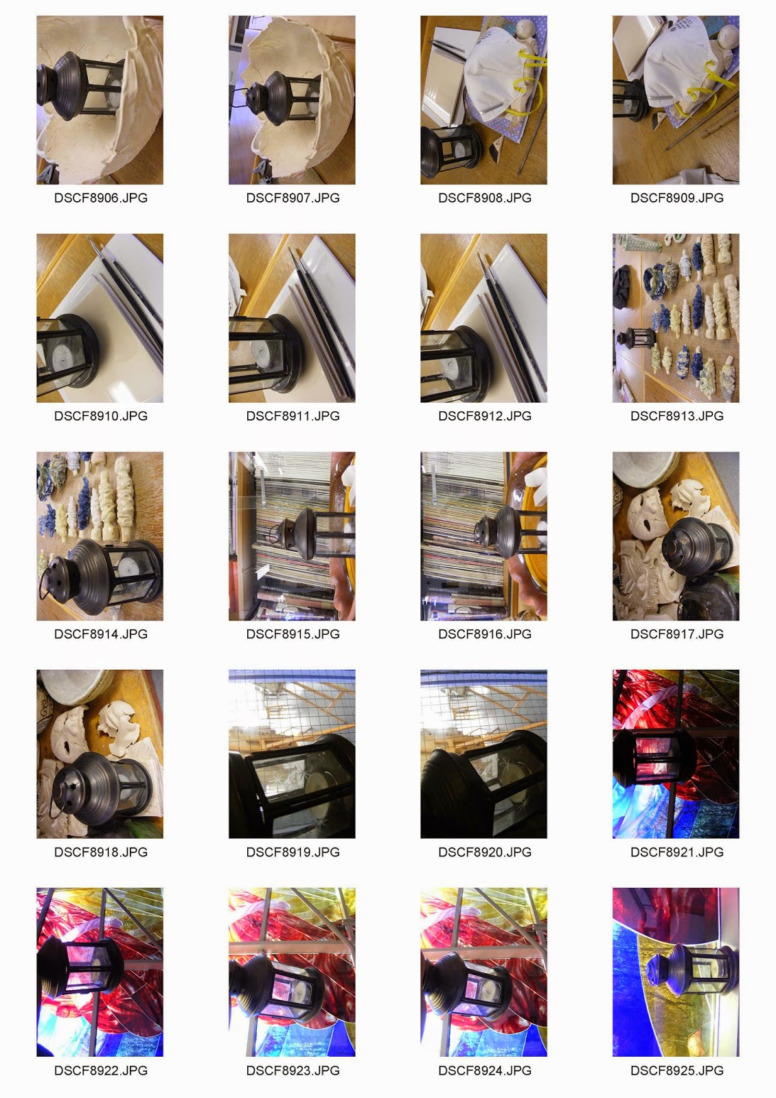
Contact Prints


Diptychs

Art
Here's an art diptych that shows before and after - in the same location. I really like how 3 of the colours are all included in both images which makes the location fit in. The lighting also seems very equal on both images making it look like its been taken in the same time frame even though it was a day apart. The lantern has been placed and captured in a silhouette effect which brings out the sparkly star on the glass. The yellow window frame also fits with the lantern making it look lit up. I think the silhouette had to be considered because otherwise it would have just made the window the main attraction. The darkness of the lantern actually reveals the shape and makes it stand out from the colourful walls. I think this inanimate object was well suited in the location and just brings colour into the darkness like a contrast.  

Fashion
For this diptych, i went for a different approach for fashion and focused on the candle in the lantern with these other candles i found in an gallery. The fashion concept isn't about clothes the way my other bit of research was but this is almost like a fashionable world for candles. These little candles are usually used for display so i thought i'd think outside the box to make the location fit in and kind of show the lantern close up to other candles like a display or a fashion icon. The star on the glass was also visible again but isn't as effective as the previous image because the lighting here is bright. It was taken under a mixture of artificial room lights and some windows from what i recall. Another perspective that this diptych could show is how the candle is placed into a lantern, and how i mention that they can be used to be fashionably displayed like they have been on the glass pallet like in the first image.

Industrial
So considering that we had to make the inanimate object fit in, well i thought of using this location of a gallery to show industrial. The thoughts behind the image was how the location interior was practically empty and the wood above looks like it's being built. So as my object is a lantern, well i made it look as though its been hanged. Now in terms of scale, you can tell it's not been hanged literally but i just thought it works as it's in the centre top. The lighting is a mixture of artificial and natural as you can see some windows and room lights. What i like about this is how the first image has shadows along the wall so it looks dark and the second image with a lantern in the middle has some sort of spot light along the back wall making it look like the lantern is lit up and is being the source of light coincidentally.  

Documentary
This documentary genre is almost an abstract influenced diptych. I just the image i used from my previous research for documentary and re shot again with the lantern there. This one was hard to fit in as the view of the location is actually a small rooftop so i just had to hold the lantern in front and take an image. But of course there's still connections. This is all natural lighting and the light from the glass is bright enough to shine through the lantern. It just makes it fit in with the whole colour and brings this traditional element to the modern perspective. It's almost, at the slightest like juxtaposition where the two doesn't fit in but they work well together because of the tones and just brings the whole sparkle into the image because of the sparkly stars on the glass.
Historical
This image is for my historical genre. It's just showing a bookshelf full of historical books on all subjects on these old-looking, brown shelves. Then i had to re-shoot and placed the lantern in front which does represent the old days where they actually needed to carry a lantern around just for light. So this diptych reminds me of olden days where light wasn't always available the way we have access to electricity. Another perspective that i get from the image is having the lantern there for display just the way the books have been kept. Either way, it's just ideas where the inanimate object can actually fit in the location and i think this helped realise how the object can actually be part of the image not just taken at the same place.

Travel
Images were actually of the plane model that i used in the previous task. For this diptych for travel, its based upon the plane itself. The lantern would fit in because its a light source that might be required especially when planes are required a lot of checking up on and requires looking at wires and cables - which in the dark isn't very ideal. So i just thought i would place the lantern near these pokey stuff that imaginatively looks like a planes set up system. The lighting in these images are actually in daylight outdoors so it's not very pleasing when it could have been darker and I could have actually lit the candles up. But unfortunately, that wasn't possible because the lantern was borrowed for my work and it was just an additional idea.

Some Additional Diptychs

Documentary
This idea behind this diptych is just documenting some light sources. The image on the left shows the light source close up, then its put with a lantern which shows the types of light sources. I like the composition in the left image the way it leads you in the picture. There is a use of depth of field as the foreground is more in focus than the background. The second image includes me using the inanimate object to make it fit in the location. And I think I accomplished that by putting it on top of a light in the same location. It's slightly a contrast because it shows this olden traditional lantern and then you also have the advanced LED lights.

Historical
This historical diptych focuses on the clay object with these brown golden look. The clay represents olden times as it used to be used a lot more than nowadays to create art and create other objects. This model here looks like a cracked egg. So I thought of placing the lantern in this to make it look like a holder. This was taken indoors, so there was mainly artificial lighting and some window light which you can see in the background. I think the artificial lighting on top of the classroom has given the lantern a shine, those lighter tones direct your eyes. I like how the clay in the first image contrasts with the colours in the background making it stand out, also because there's a shadow under it giving it a nice 3-D effect. 

Art
This art image was the same image for the first half of research. I chosen the higher contrast image because the dark tones of black fit in with the lantern. The second image is taken without flash because there was lots of light coming from the window alongside with the artificial lights. The object somehow fits in because it's also taken as a close up so the top bit of the lantern is cut off, and the remaining bits show the candle and the windows in good details. If i had a chance to reshoot this, it would be a better image if i removed the white paper in the background which distracts the image. Otherwise the position of the brushes are almost identical, which are both taken on different days with different lighting.
 
Industrial
Here is an industrial diptych that has been taken indoors. It was taken using artificial flash which makes the left image look very bright and faded. The second image was also taken with flash also near a window - which actually reflects light on the lantern making it faded. This gives an effect that it's trash because of the lack of colour and it makes it look dirty. The lighting on the soil is different on the second image because placing the lantern there created shadows on the soil. This makes the image focus on the lantern because it's much brighter. The image links with industrial because i was thinking of construction and soil and metal just combine together to create this building site; When in fact, it was taken at an old flowerpot.

Tuesday, 20 January 2015

Task 1a - Primary Research (Practical)

For this task, we had to take images focusing on location. We were given some genres including: documentary, industrial, travel, historical, fashion and art. We had to take images based upon locations indoor and outdoors for each genre. Below are my contacts for my shoot.

Contact Prints


Best Images
Outdoors

Industrial


Travel


Historical


Fashion


Art


Documentary


Best Images
Indoor Images

Industrial


Travel


Historical


Fashion


Art


Documentary


Diptychs


Art

This is my art diptych with locations from indoors and outdoors. The idea behind it is before and after. The indoor image on the left links with the art genre because of the simplistic view of a brush and the card; looks like an painter setting up before they create a painting. The location is in a classroom and the image has been really close up so that you can just about see the wood texture on the table and the image isn't cluttered with excess objects. I think the location is perfect because it ties in with where art is made. It just simply focuses on the brush and the card like a combination together. It's mainly close up because it gives the feeling of being indoors and gives a element of closure. The outdoor image is a graffiti piece of art which does differ from the painter side of things. It links with the location because its graffiti on a wall. Graffiti is an expressive type of art. Usually it has a lot more emotions being expressed by the artist, and they usually use a nice bright colour so it stands out as you walk along the street. This was taken in Bradford near centenary square. I wanted to just focus on the art work but due to the skip in front, it kind of disturbs the image. Would make a better image if it has been taken with no excess things around. I tried moving around and capturing it in different angles but it would just cut off the artwork so it didn't really work. On the other hand, It gives it this urban vibe of the streets which does give it a nice touch. The lighting on the left image is really good due to artificial flash. There's a bit of a shine on the edge because of the artificial classroom light above but I think the object is caught within the same light level so the contrast with black brushes stands out on the white, neutral canvas. Using flash made the image slightly brighter which just gives the image a better feeling.
Additional Art

This diptych was actually an error I made without realising, I think I got carried away with the idea of capturing art in locations forgetting that it's to do with indoors and outdoors. it links with the first diptych of the art genre but the location are both indoors. However, it does demonstrate the concept of the before and after with all the art materials to a final painting. Furthermore, the picture on the left is the same as above but this one is slightly different. The lighting is a lot more darker and you can almost see some shadows. Reason being is because this image was taken without flash which makes the image have more contrast due to the classroom being slightly dull in light. There is a slight shadow formed near the brush which i like. But the image as a whole is too dark in my opinion as you can see the texture and form of the table stand out drastically. I think the brighter image above is better because this contrast is very dark which makes the brushes look dark and the other one has lighter contrast which gives it more of a finer look.

Travel

I have selected these images for travel. I think these images fit the location because they link to travel. The first image on the left side is taken outdoors. It was taken with natural lighting and i think it was best because it was an average, bright day. The location we chose is Bradford Studio School and they have a plane feature outside. I composed this image this way because i liked the white corner moving in to the image which leads your eyes into the picture. The image is taken at eye level which does give scale to how big the plane looks. In front of it is a tree which doesn't distract it much in my opinion because it's behind the plane. The colours are very much similar so there are no strong distractions that take your eyes away from the subject. Furthermore, the image on the right is indoors. I have other examples in my contact prints but i put this together for the mischievous reasons that the arrow is pointing that way. But initially, the image does represent travel in a different perspective. It's a sign that tells you were to travel. It gives directions so i thought it has got some connection to travelling. It's also a familiar and common fire exit sign, which is in all public places so it links to being indoors. The image is very simple and shows the sign in the middle. I tried getting it as straight as possible without a tripod but my camera didn't have no grids. This was taken under artificial lighting from lights in the hallway. I think there was no flash because it makes the sign shine. and kind of gives an area more exposure as i was standing close up. 

Fashion
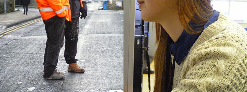
For my fashion diptych, i have selected these two images. The left image is taken outdoors of college. It was using natural lighting and I think it works really well with location. The builder is wearing an orange jacket and that immediately captures your attention. I like the body gesture that is presented by the two men as they are standing with their hands by their side or in their pockets. I think by capturing some of the road, it sets the location and you can see the focus is on the men. Also because the man in the orange ain't exactly in the middle and he's slightly to the left, it fits with the rule of thirds. Looking at a fashion perspective, the fact that they're wearing builders uniform and you can see some of the road, it kinda just combines together. The lighting is good because its not such a dark weather. If it was dark, i think it wouldn't suit fashion because it would lack light and details in the clothes, which is the most important in my opinion. But to another extent, it might make his neon orange jacket glow if some light hits on it from either street lamps or by using flash. I like how i never captured their whole body or their face because the frame just focuses on the clothes, which makes the image fit the genre. On the other hand, the image on the right is indoors. It is a close up which contrasts with the left image which is more a further shot. It was taken under artificial lighting mainly but there are bits of natural lighting coming through the window as you can see in the far back right. This image has been captured this way where the models face is not completely shown but just a glimpse so the main focus goes on the clothes. I liked how in this occasion, the clothes is actually this neutral cream colour which makes it very bold within the image. The focus seems very sharp in the foreground and you can really see the stitching of the jumper. I think this is what makes it a good fashion post. Location also works well because you see the model face and body facing left and beside her you can see a desktop. This gives it the impression that she is on the computer posing and her clothes are the main feature.

Industrial
For me, industrial is all about transformation in society. I have selected these two images that represent industrialization to me. The diptych actually shows this transformation in the industry and how things have developed. In the left image, it is a flower base that had soil and bits of metal scrap. I captured this base from afar so it can capture the metal scrap. This was taken indoors with artificial flash. Using flash, it made the image slightly bright and you can see every detail in the mud. I tried taking some closeups that are in my contacts but i think this works beside the other picture. The picture beside is of a petrol station. This is almost like a comparison of industry from the past to the present. The before and after element shows how the economy has grown since agriculture and now we are much more wealthier. I like the way the image is composed outdoors, in natural lighting. The front row does have the focus that leads on to the rest of the pumps - especially with the red that just grabs attention. I like how there's reflections on the floor from the rain which makes it stand out. In comparison to the pictures put together, it does really push the idea of before and after so much that you can almost just realise the change by looking at it. This is what i think the concept was for my pictures as i thought of industrial. To just see the difference from the past to now.

Documentary
My documentary idea is very similar to historical and industrialization. The left side image just shows old antique clay models and that is put together with an architectural image. It just documents the difference and how much has progressed. Industrial is about changes in society, economy and technology but this is more how advance we become in creativity. It shows how we start with clay to create something back in the days and now we have new modern buildings with the whole simplistic elements. The indoors image has different light sources, there's natural lighting through the window and then we have the classroom light which is artificial. The mixture does give it a nice and simple shot that isn't too focused on techniques. It just shows a load of materials on the desk. I like how everything here is all brown coloured themed, this gives it this old effect as we associate brown with old. This is one of the reasons why i think this place is very good with location for this genre. On the other hand, the other image has this slick modern twist where we don't have the browns and we have the more neutral tones. We have shades of black, cream and the glass top with grills. This image just documents the way things are in 2015. It is a big contrast with the other image and that's why i think this makes it a good image for the task. It was taken outdoors near city park, with natural lighting. I could have used artificial flash but I chose not to because of the dark elements on the walls, on the cream bits. I like how the light through the glass panels are overpowering making it look like its actually indoors but it's just a small rooftop completely outside. 

History - Before
History - After
Here is my history diptych. Focusing on the before one, the outdoor image is of a statue and it was taken with natural lighting. However i think it lacked contrast and wall in front was a distraction. Because of the lack of contrast, it makes it look dull coloured and has no good effect. The second image was fairly good, the image is in focus and you can see the wallpaper behind and the light pattern thing it's hanging from. This little aspects made up the historic genre. After making this diptych, i chose to re-shoot this and just make a tad improvement. 

Then i ended up with the after diptych. For the outdoor image, I went back to the same location and retook the image. This time, i avoided the wall in front as much as i can and I made it look more darker so it has this old, historic element to it. Also, the tree behind is actually sharper in focus and i like how this occurred because its almost coming out of the statue from the position i captured it from. The actual statue is slightly out of blur because i didn't worry so much about the writing on it but the actual green rusty look i was going for especially with the added contrast. The second image i retook which turned out better too. I took it from a different aspect and focused it on some parts of the light as it looks antique anyways. This was at the media museum. The back wallpaper is still shown and i think the colour compared to the other one is much more contrasted darker and bold. This makes it very historic because it's old - rather than looking bright and fresh/new.