For this task, we had to create our very own colour popping images. Colour popping is when majority of an image is black and white and you'll have a subject that is present in colour. This makes a subject stand out in the image and draws viewers attention.

Here is an example of colour popping on these red telephone box. The image works well when the subject is vibrant and bright. In this case, red is the subject colour which is initially a bold colour that stands out. I think it's better when the subject is composed in the middle of the shot because it's easier to see. This slightly uses the rules of thirds in the way it's been composed. It's also got elements of leading lines with the phone boxes.
Here are my images:
 |
| Before and After |
This colour popping image was taken in Trinity Leeds using my colour film. I decided to capture this H&M logo in the centre of the frame because in that way the composition is easy to the eye. I think it's worked great for a colour popping because the logo colour is red and it's a bold colour that instantly stands out. It was easy to edit this image because the subject was big enough to erase out and that allowed me to focus on the smaller details around the edges.
 |
| Before and After |
Here's another example I've created based on interior elements of Architecture. In this image, I've selected the yellow lights as my subject and I like the outcome of the colour popping. The lights are almost leading into the image and that gives it a nice touch. Yellow is also another bright colour that stands out so I think it's great for colour popping. I like how I've captured this image in a vertical format because it is very selective with the lights in the shot. This edit was slightly more tougher than the previous one because there is the gaps in-between the light so I had to really focus on erasing. But the technique was easy to do so I enjoyed creating it.
 |
| Untouched version |
 |
| Cleaned up version |
 |
| Before and After |
This image is coincidently like the first two combined with the red and the light as the subject. The actual image had so much marks from the lens so I thought I'd create a cleaned up version to show how it differs. However, I seem to like the dusty effect more because it looks like scratches and this communicates as an old, retro effect to this new architecture. The image itself has been composed well at a straight angle and I like how it's composed on a landscape format because we have that slight wider look to the image. This edit was fairly easy to do because of the previous ones I've done.
 |
| Before and After |
In this image, there is not much colour except the cyan background. Therefore the colour popping wasn't the best example. However it just comes to show that we need the image to have a variety of bright vibrant colours for a subject to really stand out. I like the content of the image with the retro lights. I think the image really works with film cameras because it enhances an old effect with the grains.
 |
| Before and After |
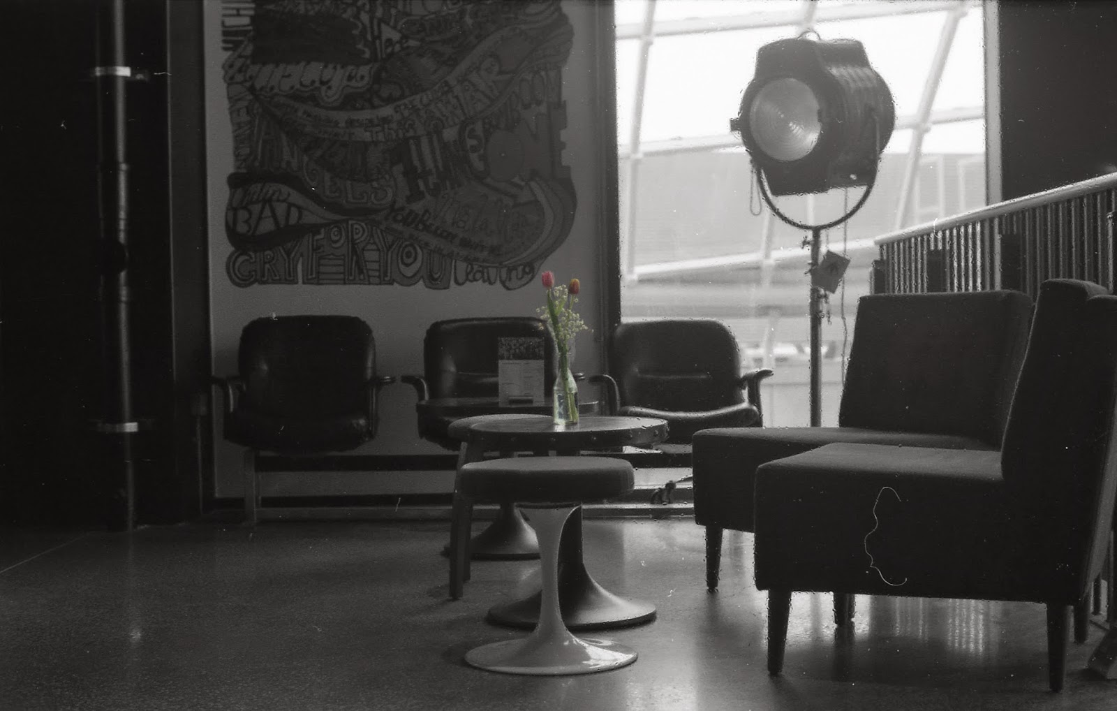
This example can only been seen when the image is blown up because the subject that is colour popped is very small. The flowers were my main subject and that is because it was the most colourful thing. Like the previous edit, this also has slightly faded colours because of the lighting that is presence. I like the image itself because it has been taken at a low angle and the concept of the image is interior for new architecture.
 |
| Before and After |
This image focuses on the brown bits on the steps and the stairway banister. Referring back to previous project, I used leading lines as a technique to show the banister lead a path into the image. I think the colour does stand out on the popper but overall the actual image does not have much colour. In terms of architecture, it was showing modern architecture elements with the metal grills between the steps. This was why I've taken it from a low angle and close up to emphasis this element.
 |
| Before and After |
This image initially has a red tone to the background. Colour popping has blackened out the background and made the sign stand out. Also, the image has a lot of scratches and it gives it this retro effect. I think it gives it a great related effect because of the american styled lights. This image shows us how modern architecture is now bringing back old fashioned elements. It is cool and quirky for us because they are hardly around in this day and age.
 |
| Before and After |
Here's an edit that didn't quite go to plan. There is hardly any difference in the result because I only erased the glowing bit on the red light. I've experimented with the image to only have one colour stand out but it wouldn't quite look right. This image was actually one of my digital images which differs from the rest of my edits. I wanted to make one just so it doesn't look grainy which could possibly change the effect that a film camera can give.
 |
| Cleaned up version |
 |
| Untouched version |
 |
| Before and After |
This is my favourite colour popping edit I've made. From the composition of the image to the leading lines element. I decided to use the lights as my subject for the colour pop. This is a very subtle colour and it stands out nicely without it having to be so bold. Referring back to our previous project, I also used rules of third as I was capturing this image for that eye catching subject. The lights are nicely leaded into the image and the vertical format also captured the image from top to bottom the way I envisioned it to be for this architectural image. As I've completed the colour popping, I was left with the untouched version. There was some scratches and dust on the image that I think really works with the image. It gives it this american, retro style effect which contradict the element of new architecture as it gives it an older effect. The interior side of new architecture is now going back to old styles. The lights itself are very american styled and it just works with this scratched quirky effect. However, I also created a cleaned up version because it suits the modern architecture a little more. It has this matt look to it with elements of this old but remake interior designs. Now I've decided to use this cleaned up version for one of my finals because I think it has well considered camera techniques and the colour popping focuses on repetitive lights into the image.


No comments:
Post a Comment