Juxtaposition is where elements in a photograph that either contrasts with each other or an element contributes to make up a theme. For example, my idea in mind was to do old buildings with a new built building. This juxtaposition is putting the two together and you can almost see how they contrast from each other.
Contact Sheets


 |
| First Attempt |
This photoshoot was helpful where I've found some examples of these buildings that demonstrate juxtapositions. However, the weather wasn't very ideal and that has effected the images to look dark and dull. So then we went out again to re-shoot when it was bright and sunny.


 |
| 2nd Attempt |
These images were slightly better. I took every shot on manual but I think the weather still wasn't the best because the clouds changed darker constantly as soon as we got out again. But there is a slight different on the images from the 1st shoot.
 |
| 1st Attempt |
Here is one of the images from my 1st attempt. The juxtaposition I was focusing on was old and new. I think I did a good job with this shot. I was aiming to get the new one building in front to relate it to most recent and the older building more to the back. I decided to shoot in vertical format because I wanted to get bits of the building rather than a wider view on landscape. As I've mentioned, the weather really effects the weather because there's not much sunlight outside hence why the colours are very dark and dull.
 |
| 2nd Attempt |
This was my second attempt at this shot, later on in the day. There is some cloud compared to before. It has also lightened up the newer building with some sunlight. You can see on the glass and the pillar that the sunlight is positioned on the left side of the image. The older building is also brighter and you can see the dark spots where the rain has been hitting on it from earlier on. I think this sort of shot would be the best in a hot, sunny day with a nice exposure.
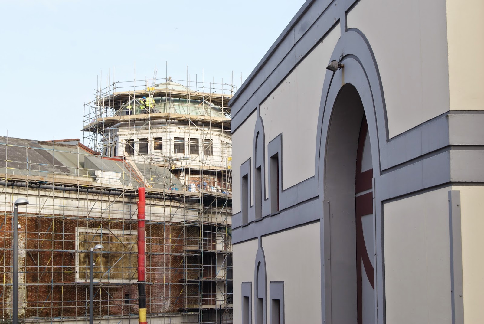 |
| Construction vs Completed Building |
This image shows juxtaposition with a construction site battling a completed building. I think it's similar like a before and after image showing both sides from the centre. I like the way the angle is used for effect to show both left and right of each sides to come together in the middle. Idea behind the image was to show how each stages of two different building contrast with each other. I like how the Alhambra is more of a foreground and the angle of the building leads you into the image. The exposure was nicely taken and there is a nice blue sky in the back to accompany the image.
 |
| Additional |
Here is another image i shot of a telephone box near a new building. I'm wasn't completely sure what the juxtaposition is but I had a feeling there was more to it. I just felt like that location I was in was full of new buildings and attractions from the past few years. Then there was this telephone box which in my opinion is something that's old. Red telephone boxes in general has been existing from 1900's. I just felt this connection that old things like this phone box and buildings are all being refurbished into something more advanced. So the juxtaposition for this image is actually the changes in development.
------------------------------------------------------------------------------------------------------------
After the first try, I realised that I found this task quite challenging. It was tough to capture juxtaposition in Bradford or anywhere in my head. It was hard trying to get my head around it.
So therefore I felt like I needed to do more examples and work more on juxtaposition.
 |
| Old and New |
 |
| Before and After |
This idea of juxtaposition is comparing a building site as before - to a new building as after. I like how the digger vehicle is in the image and that represents the building site; Alongside with the yellow cabin and the digger beside it. You can also see the remaining broken pieces from the old building. I like how the shot looks wide so they are both fairly equally next to each other. This is being a contrast to the new building on the right side. You can see the colours are matt and vibrant compared to older architecture. There is simplistic designs with the windows and the brickwork. The bricks are also a lot bigger which differs from old architecture.
 |
| Old and New |
This juxtaposition image is portraying the old architecture in the foreground in comparison to the new architecture in the back. The way the image is captured, it represents the scale element that we've previously touched on as the new architecture buildings are built much higher. This image shows the comparison between height in the two. You can also see how they differ with the materials that are used. The older buildings have chimney and you can see the brickwork. Whereas the new architecture uses matt colours and the windows are much more dominant. The shape of the building itself is very unique with the edgy curved top when the Bradford College logo is.
 |
| Old and New Textures |
This image is a closer detailed image on both architecture styles. I was focusing on the textures from both of these buildings. You can see how simplistic the new architecture is. The bricks or tiles are huge and it looks so smooth with the light, faded look they have. There is also the wooden slate top which compliments the brick wall. In comparison, the old building looks much more gritty with darker and smaller bricks. They also have more details in the structure and design with the balcony style top. You can also slightly see a chimney which is common in these buildings. As the building is old, it has made the bricks to be dark dirty which makes it look really rough and adds a darker tone.
No comments:
Post a Comment