In this primary research task, we had to work in groups of 4 and take photographs of Bradford's Architecture. We had to take a minimum of 4 specific images using photographic techniques and angles, and then consider why we've taken it that way linking it to Architecture.
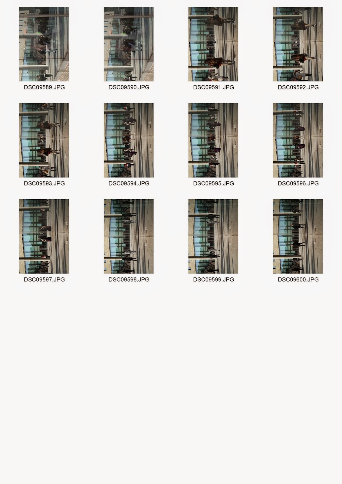
Contact Prints
First Attempt


 |
| Best Images |
Image Analysis
 |
| Group Member's Favourite Building |
This was one of the first set of images we had to take. We were asked to photograph one of our group member in front of their favourite building in Bradford. So my friend Angelika here likes the Alhambra architecture because the colours and design coordinates well for a theatre. I had to consider how I photograph the building with Angelika in the shot, so I thought of doing a low angled, over the shoulder shot where you can see her eyes looking upwards at building. I also thought of making her slightly out of focus using depth of field so the building is in complete focus and you can immediately notice the building. It was taken as a landscape format because you can see a longer view of the building and it allows me to also include Angelika in the shot with a longer width. Using low angle also makes Angelika look very small and vulnerable as you can tell by her body expression as she looks up. In comparison, the building is given scale and really emphasises on it's size.
This was the second image we had to collect. A reflection of the group on a building. I think the image does show our reflections nice and clear. It was taken at a glass door, this allows all the light to reflect upon the glass giving it a nice mirror effect with vibrant colours. I think you can see the colours very vibrantly for a reflection and the blur gives it this glass reflection effect. Inside the glass you can see the stairway. The image was taken landscape to fit us all in, and it's taken at a neutral angle. I tried to take different approaches like crouching and as such but i think the reflection would just turn into our shadow making it look like a silhouette. So I think this was decent to fit into the task.
 |
| Reflection of Group Members |
This was the second image we had to collect. A reflection of the group on a building. I think the image does show our reflections nice and clear. It was taken at a glass door, this allows all the light to reflect upon the glass giving it a nice mirror effect with vibrant colours. I think you can see the colours very vibrantly for a reflection and the blur gives it this glass reflection effect. Inside the glass you can see the stairway. The image was taken landscape to fit us all in, and it's taken at a neutral angle. I tried to take different approaches like crouching and as such but i think the reflection would just turn into our shadow making it look like a silhouette. So I think this was decent to fit into the task.
 |
| Building that was built in 1913 or earlier. |
This image was the third set we had to collect; for a building that was built in 1913 or earlier. The building I've captured is the old building for Bradford's College. It was built in 1882 and it represents old architecture. I've taken this image of the top tower closely with a landscape format. It was taken using the automatic mode because the weather wasn't ideal so i wanted to capture it quickly and continue. I think this impacted the image being slightly over exposed. Initially, i was thinking of capturing this using the rule of thirds. Using low angle, it also builds scale to the image, and the sky background really empahasises that. I think it would be a nicer image if the weather was nicer and the building doesn't seem too high in contrast which loses details on the architecture. Looking at the building, there are lots of details on the pillars and the windows are minimal to the architecture. Old buildings has a lot more details in every corners making it very detailed.
 |
| Building that was built in 2010 onwards. |
This image was the fourth set we had to collect; for a building that was built in 2010 or onwards. I chose the University of Bradford that was built in 2011. The building is a captured closely this way because I wanted to show the two elements of wood panels and these smooth tiles. I used the landscape format because it allows you to fit more in horizontally. I like the colours that look very warm. The colours are slightly similar to the old building with the brown colours but you can see the difference with the materials that are used. These modern buildings are much more simplistic and there's hardly much details on the architecture apart from the windows. I like how this is slightly low angle so you're looking upwards just like you would in reality. The lines on the wood panels also lead you into the image as we've looked at before. There is also an element of pattern seen in the architecture. Making it very sophisticated and modern.
After handing these 4 images for some feedback, i knew that the old building was my weakest image and i'd have to re-shoot again. There was a few more others in that contact print but i wanted to risk it and show that side of the building. So the feedback was actually expected that I need to capture using manual settings, so then I went and conducted a second attempt.
Contact Prints
Second Attempt


Coincidentally, the weather is bright and sunny the day I went to re-shoot some of these images. This actually boosts the mood and quality of the images with some nice bright sunlight which allows the camera to control the light easier than when the weather is dark and dull. Using manual settings, I think I've really improved these sets of images with a better exposure, and more accurate techniques.
 |
| Second Attempt - Building, 1913 or earlier. |
|
| Before. |
This is a re-shot image of the building built in 1913 or earlier. You can see this time the exposure is much better. There's more sharper little details in the image of the architecture, that are much more visible than before. I also changed the format from landscape to portrait after considering the feedback. This gives it a better use of technique with the low angle emphasising on scale of the building. This time the sky is also much more vibrant and contrasts with the building. The colours is very much accurate the way we'd see it in real life and you can instantly see the difference with weather changes between both the images. This demonstrates how the dark exposure can really lower your mood and this bright, vibrant image boosts your emotions. It actually gets you to interact with the architecture of the building because it draws you in (Presumably as architecture might be boring to some). I think this time round, it was better to forget about using the rule of thirds and focus on the angles as a technique as it really brings out different effects on buildings.
 |
| Reflection on a building. |
 |
| Before. |
This is the re-shot image of reflection on a building. If you look at the floor tiles closer to the bottom of the image, you can see how it's all in line and the image is carried straight through. I liked the concept of capturing half reality and half reflection. This was taken on manual settings and you can see it's been exposed nicely. The image looks very symmetrical and the glass side is very faded in comparison to the real life side. The shadows on the floor are also very nicely in this reflection. I think the image has been well composed as closely as i could get it to capture it's reflection. It would be nice to get it right in the middle but that would be practically impossible. It was a very good attempt and i think the result is also nice to see. If you compare it to before, you can see a different perspective of capturing reflection on a building. That was directly from a glass and this shows both elements. The shot has been captured nicely because you can see these poles are very symmetrical. The man is just about to walk off and it looks like his modelling. This actually adds a nice touch for the reflection because you can see his image is flipped which gives it away that it's a reflection on a glass. The natural lighting is also a plus to the image because it helped me capture this shot otherwise the reflection would be very translucent which could possibly make the image not work so effectively.
Some Background Research Links:
http://www.britishlistedbuildings.co.uk/en-336467-bradford-college-old-building-
http://www.bdonline.co.uk/farrell-and-clark-wins-planning-for-bradford-university-building/3161694.article
Some Background Research Links:
http://www.britishlistedbuildings.co.uk/en-336467-bradford-college-old-building-
http://www.bdonline.co.uk/farrell-and-clark-wins-planning-for-bradford-university-building/3161694.article
No comments:
Post a Comment