Tuesday, 20 January 2015

Task 1a - Primary Research (Practical)

For this task, we had to take images focusing on location. We were given some genres including: documentary, industrial, travel, historical, fashion and art. We had to take images based upon locations indoor and outdoors for each genre. Below are my contacts for my shoot.

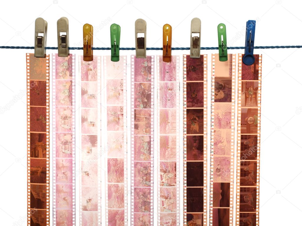
Contact Prints


Best Images
Outdoors

Industrial


Travel


Historical


Fashion


Art


Documentary


Best Images
Indoor Images

Industrial


Travel


Historical


Fashion


Art


Documentary


Diptychs


Art

This is my art diptych with locations from indoors and outdoors. The idea behind it is before and after. The indoor image on the left links with the art genre because of the simplistic view of a brush and the card; looks like an painter setting up before they create a painting. The location is in a classroom and the image has been really close up so that you can just about see the wood texture on the table and the image isn't cluttered with excess objects. I think the location is perfect because it ties in with where art is made. It just simply focuses on the brush and the card like a combination together. It's mainly close up because it gives the feeling of being indoors and gives a element of closure. The outdoor image is a graffiti piece of art which does differ from the painter side of things. It links with the location because its graffiti on a wall. Graffiti is an expressive type of art. Usually it has a lot more emotions being expressed by the artist, and they usually use a nice bright colour so it stands out as you walk along the street. This was taken in Bradford near centenary square. I wanted to just focus on the art work but due to the skip in front, it kind of disturbs the image. Would make a better image if it has been taken with no excess things around. I tried moving around and capturing it in different angles but it would just cut off the artwork so it didn't really work. On the other hand, It gives it this urban vibe of the streets which does give it a nice touch. The lighting on the left image is really good due to artificial flash. There's a bit of a shine on the edge because of the artificial classroom light above but I think the object is caught within the same light level so the contrast with black brushes stands out on the white, neutral canvas. Using flash made the image slightly brighter which just gives the image a better feeling.

Additional Art

This diptych was actually an error I made without realising, I think I got carried away with the idea of capturing art in locations forgetting that it's to do with indoors and outdoors. it links with the first diptych of the art genre but the location are both indoors. However, it does demonstrate the concept of the before and after with all the art materials to a final painting. Furthermore, the picture on the left is the same as above but this one is slightly different. The lighting is a lot more darker and you can almost see some shadows. Reason being is because this image was taken without flash which makes the image have more contrast due to the classroom being slightly dull in light. There is a slight shadow formed near the brush which i like. But the image as a whole is too dark in my opinion as you can see the texture and form of the table stand out drastically. I think the brighter image above is better because this contrast is very dark which makes the brushes look dark and the other one has lighter contrast which gives it more of a finer look.

Travel

I have selected these images for travel. I think these images fit the location because they link to travel. The first image on the left side is taken outdoors. It was taken with natural lighting and i think it was best because it was an average, bright day. The location we chose is Bradford Studio School and they have a plane feature outside. I composed this image this way because i liked the white corner moving in to the image which leads your eyes into the picture. The image is taken at eye level which does give scale to how big the plane looks. In front of it is a tree which doesn't distract it much in my opinion because it's behind the plane. The colours are very much similar so there are no strong distractions that take your eyes away from the subject. Furthermore, the image on the right is indoors. I have other examples in my contact prints but i put this together for the mischievous reasons that the arrow is pointing that way. But initially, the image does represent travel in a different perspective. It's a sign that tells you were to travel. It gives directions so i thought it has got some connection to travelling. It's also a familiar and common fire exit sign, which is in all public places so it links to being indoors. The image is very simple and shows the sign in the middle. I tried getting it as straight as possible without a tripod but my camera didn't have no grids. This was taken under artificial lighting from lights in the hallway. I think there was no flash because it makes the sign shine. and kind of gives an area more exposure as i was standing close up. 
Fashion
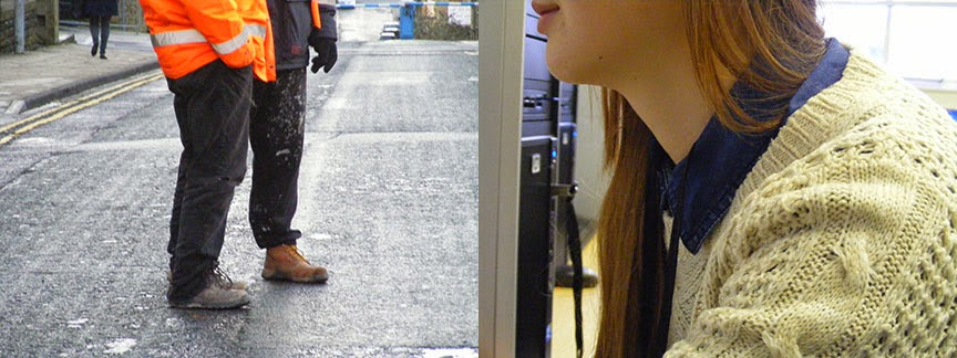
For my fashion diptych, i have selected these two images. The left image is taken outdoors of college. It was using natural lighting and I think it works really well with location. The builder is wearing an orange jacket and that immediately captures your attention. I like the body gesture that is presented by the two men as they are standing with their hands by their side or in their pockets. I think by capturing some of the road, it sets the location and you can see the focus is on the men. Also because the man in the orange ain't exactly in the middle and he's slightly to the left, it fits with the rule of thirds. Looking at a fashion perspective, the fact that they're wearing builders uniform and you can see some of the road, it kinda just combines together. The lighting is good because its not such a dark weather. If it was dark, i think it wouldn't suit fashion because it would lack light and details in the clothes, which is the most important in my opinion. But to another extent, it might make his neon orange jacket glow if some light hits on it from either street lamps or by using flash. I like how i never captured their whole body or their face because the frame just focuses on the clothes, which makes the image fit the genre. On the other hand, the image on the right is indoors. It is a close up which contrasts with the left image which is more a further shot. It was taken under artificial lighting mainly but there are bits of natural lighting coming through the window as you can see in the far back right. This image has been captured this way where the models face is not completely shown but just a glimpse so the main focus goes on the clothes. I liked how in this occasion, the clothes is actually this neutral cream colour which makes it very bold within the image. The focus seems very sharp in the foreground and you can really see the stitching of the jumper. I think this is what makes it a good fashion post. Location also works well because you see the model face and body facing left and beside her you can see a desktop. This gives it the impression that she is on the computer posing and her clothes are the main feature.

Industrial
For me, industrial is all about transformation in society. I have selected these two images that represent industrialization to me. The diptych actually shows this transformation in the industry and how things have developed. In the left image, it is a flower base that had soil and bits of metal scrap. I captured this base from afar so it can capture the metal scrap. This was taken indoors with artificial flash. Using flash, it made the image slightly bright and you can see every detail in the mud. I tried taking some closeups that are in my contacts but i think this works beside the other picture. The picture beside is of a petrol station. This is almost like a comparison of industry from the past to the present. The before and after element shows how the economy has grown since agriculture and now we are much more wealthier. I like the way the image is composed outdoors, in natural lighting. The front row does have the focus that leads on to the rest of the pumps - especially with the red that just grabs attention. I like how there's reflections on the floor from the rain which makes it stand out. In comparison to the pictures put together, it does really push the idea of before and after so much that you can almost just realise the change by looking at it. This is what i think the concept was for my pictures as i thought of industrial. To just see the difference from the past to now.

Documentary
My documentary idea is very similar to historical and industrialization. The left side image just shows old antique clay models and that is put together with an architectural image. It just documents the difference and how much has progressed. Industrial is about changes in society, economy and technology but this is more how advance we become in creativity. It shows how we start with clay to create something back in the days and now we have new modern buildings with the whole simplistic elements. The indoors image has different light sources, there's natural lighting through the window and then we have the classroom light which is artificial. The mixture does give it a nice and simple shot that isn't too focused on techniques. It just shows a load of materials on the desk. I like how everything here is all brown coloured themed, this gives it this old effect as we associate brown with old. This is one of the reasons why i think this place is very good with location for this genre. On the other hand, the other image has this slick modern twist where we don't have the browns and we have the more neutral tones. We have shades of black, cream and the glass top with grills. This image just documents the way things are in 2015. It is a big contrast with the other image and that's why i think this makes it a good image for the task. It was taken outdoors near city park, with natural lighting. I could have used artificial flash but I chose not to because of the dark elements on the walls, on the cream bits. I like how the light through the glass panels are overpowering making it look like its actually indoors but it's just a small rooftop completely outside. 

History - Before
History - After
Here is my history diptych. Focusing on the before one, the outdoor image is of a statue and it was taken with natural lighting. However i think it lacked contrast and wall in front was a distraction. Because of the lack of contrast, it makes it look dull coloured and has no good effect. The second image was fairly good, the image is in focus and you can see the wallpaper behind and the light pattern thing it's hanging from. This little aspects made up the historic genre. After making this diptych, i chose to re-shoot this and just make a tad improvement. 

Then i ended up with the after diptych. For the outdoor image, I went back to the same location and retook the image. This time, i avoided the wall in front as much as i can and I made it look more darker so it has this old, historic element to it. Also, the tree behind is actually sharper in focus and i like how this occurred because its almost coming out of the statue from the position i captured it from. The actual statue is slightly out of blur because i didn't worry so much about the writing on it but the actual green rusty look i was going for especially with the added contrast. The second image i retook which turned out better too. I took it from a different aspect and focused it on some parts of the light as it looks antique anyways. This was at the media museum. The back wallpaper is still shown and i think the colour compared to the other one is much more contrasted darker and bold. This makes it very historic because it's old - rather than looking bright and fresh/new. 


Tuesday, 9 December 2014

Evaluation

In this unit, we focused on capturing movement using film and digital photography. We learned about shutter speed and how using a different range allows us to get different effects. Long shutter speed gives us this blur effect which does personify movement. We also learned about aperture and how light is also controlled by us.

Task 1
For this task, we had to find examples of artists who showed movements in their work and talk about how it may have been created. I found some examples from the library and the internet and shown how it may have been created, along with what effects it has by the way it's shot. I have also linked my work to my artists and the examples I chose. For example, the long exposure of vehicle zooming off for my dark room image was inspired by the red bus reference. This task wasn't really hard but it did require some time to make the work related to the concept of movement as we write it all up.

Task 1b
The time when we had to experiment and take images using manual settings - focusing on shutter speed. I sort of mentioned how it was hard when we had to note down each image settings as we took so many images and some were just a rough take. I think the task itself was fun and it was a good learning curve to learn how shutter speed worked and what sort of images we could take. This was an advantage to use these techniques before we actually had to use film cameras and produce some movement images. 

Task 2
In this task, we had to use film cameras to take images on our trip of movement. We had a short summary of how to use the cameras and then we were sent out to capture our images. I think I succeeded with my images to an extent. I was really glad that they were all exposed correctly and some images did have movement. To another small extent, I think the images weren't very perfect with the focus. I mentioned throughout this project how hard it was to make sure the focus was 100% perfect. If I can improve anything from this task, it would be to improve the focus. It has been a learning curve and the images aren't blurred that badly. It is just a flaw if I had to criticise my work. So as we took each shot, we also had to write the settings for each shot which I also managed well. Think it was a nice change to use film cameras rather than our everyday digital because we got to print them which is also fun.

Task 3
We had to research some flipbooks and explain how many shots would be required to make it a good flipbook. I think this was one of the fun times we've had when we need to research ever because we was looking at flipbooks and GIFS which was a nice change. I felt like I've been flooded with ideas. I think I managed to find some good examples that were linking to my ideas as i were searching for them. Then we had to transform our ideas into a photoshoot using continuous shooting. I think we had some images where things didn't quite turn out how we expected like when i took images of Angelika typing. The camera on continuous shooting took some time to capture in between every shot. It would sort of save to the SD card so it was kind of challenging to get images that would work really quick. To solve this, I decided not to use my camera and use the camera from Keith. Then I came up with the results and i was quite happy with my outcome because the flipbook seemed to work. Then once i created so many GIFS, it just make my vision into reality and most of them runs through really smoothly while it's on loop.

Task 4
This was when we had to make a darkroom timeline of how we created our prints. I think I managed that well. I am unsure if I missed anything major out because I had to do it from my head and I think I covered the main bits. Then we had to find examples of artists who also used darkroom printing for their work. I found some good examples and I felt like I could relate to their work because I had to do a lot of experimentation on different exposures and different contrasts, as this unit is all about darkroom practice. I gave some reasons as to why they might have used darkroom through why I would use darkroom myself such as getting different shades of blacks and whites. It's almost like Photoshop where you can change the levels and make the image look different for different effects.

Painting with Light
This activity was really fun. We used long exposure to take images of us drawing with lights. I managed to take some good shots with my group and showed a range of images where we have a high and low aperture which decides how much light is being exposed by the camera. I have also taken additional images at home which also shows a range of different outcomes. We have some that are a brightly room and some that were a dark room just by how the aperture was set. There were also examples of how bright the light source looked in the images. I think besides the fun, it was a good experimentation that helped us understand how long exposures work because it's easier to understand shutter speed when you use light as the subject (if that makes sense).

Darkroom Technical Folder
In this folder, I have all my prints collated together with descriptions of how it's been created and what effects it may have. I added some extra additional prints that I just made to show a range of different exposures. I think I could made some more bigger prints but I wanted to have 2 finals to narrow down to the best. If I had more time, I would take some more pictures with the film cameras so then I can have a better range of images. But i am happy that everything has worked the first time round.

Finals
I am really grateful about my final image. Well the car zooming off image. That picture looks really good because it shows movement in such a parallel way. You can almost tell it's a car without seeing it because of the road and the way it's composition is set. I really like how the borders around work and the whole motion blur is right in the centre. I'm pretty impressed with how I took this image on film camera which is harder than digital. The reason why the exposure and the contrast is like that because I intentionally didn't want a high contrast or the details of the blur will go. And the exposure seems just right because you can see everything subtly. 

The second of my final images is of a truck. This image does show movement and you can see the truck take off. I think this image is good but compared to the other one, you can visually see the car. This is probably because this image had a faster but long shutter speed whereas the other image was taken with a completely long shutter speed. This image also doesn't have such a high contrast because I didn't want to lose any details. I also showed an example of how a high contrast and slightly over exposed image looks. I think it makes an image look grungy and this wasn't suitable when mine was about movement. Although it is possible to have a grunge image that does show movement.

My handmade flipbook turned out to be really cool. The pages flip very smoothly and you can see how the facial expressions change. I think due to finishing everything else, I couldn't make any more and printing credit were really high when i had some additional time last minute before the deadline. It was really confusing at first to make these without any help and cutting them had to be rather accurate to make it a good flipbook. I have also created the GIF of the same images so it can be demonstrated digitally.

Overall, i think i have managed my time quite well because i finished all the tasks and activities before the deadline. The last few moments weren't as rushed as before. I feel like i'm really starting to get used to the structure of finishing work before the deadline, rather than cramping it all together. I think by evaluating how i performed previously, i have seen a change and a progression with taking the units calmly. Which leaves me some additional time if needed for any extra work or so.

Monday, 8 December 2014

Kodak Gallery Quiz


Task 4 - Darkroom Printing


Part 1:
Timeline

-STARTING POINT-

1. So you start off with getting your film processed.


2. Then you should be cutting all your film into bits. 5/6 images in each row.

3. You should now be ready to hit the darkroom. So when you first go in, you should set the cyan, magenta and yellow filters up at your workstation. Look at the grade sheet and start setting your filter with grade 3 - which is 23y and 56m. Similar to the image below.


4. You should now take out your negative carrier and select the negative you want to use. *ENSURE* that you turn your negative upside down and you place it on the carrier so the image projected would be the right way up.


5. Turn any white lights off.

6. Use the focus light on your timer to project the image on your easel. *ENSURE* that any photographic paper is put away. Now move about the easel to adjust the perfect position. Adjust how close the lens are to make the image closer and further. Make sure you follow any measurements which varies on what you're producing. Set your focus and use your focus finder to find grains on the projected image on the easel. Then turn off the focus light to move on to the next bit.


7. Now you should be ready to start. Grab some photographic paper and make sure the timer light is off. Set the timer to 10x and start with 10 seconds. To make test strips, grab a cardboard and start moving along the paper for every 10 seconds you expose the image for. 


If you're making a print, then just go ahead and expose the image to the time after you have made test strips and are happy with the results.

8. Now you will be working with chemicals. *ENSURE* that you use the tongs provided and you are not spilling the chemicals around. If any chemical is thrown into your face then a member of staff will have to take immediate action and get a eye bath ready. 


Once your images are done being exposed, you can now put them in the developer tray. This will be in the tray for 1 minute. In this period of time, you should see your image being visible on the paper.


9. Next is the stop bath. You should put your image in here for 30 seconds. This would just stop the developer and stop turning your image black.

10. Then you put your image in the fix tray. This should be in here for 30 seconds. This would fix your image so that it can be exposed to white light. 

11. Then you should put it in the water bath for 10 minutes so all the chemicals are washed off and then you can dry them overnight.


Part 2:
Research


Henri Cartier-Bresson

This was a french photographer back in 1930's who took classical black and white photography. This picture stood out for me because of how they used to consider shape as an element back in 1930's, and how we still study how shape is an element to a good photo. This image goes in spirals and you can see little kids around all looking down. It looks like it's been taken at the bottom of some sort of stairway. This was created with conventional (film) photography and i think it has influenced the image. I think this has influenced the image because of the shade of colours, it creates the shape of the stairway. Also has elements of high contrast with the kids compared to the stairs which is more low contrast. 

Classic Photography by Master Henri Cartier-Bresson

Here is another image from Henri. I like this black and white image because it's been created way back and still looks very fresh. I think this image has influenced other images that are made in this current century. It looks very cool and hipster. It's an image of a lonely man sitting with a cat just facing him. I think this could make it a good film image because the exposure looks really good and the contrast isn't too sharp so the blacks look faded just like the way tumblr filters look. It looks very calm and mysterious how there's no other people around and the streets look fairly clean. 


rjgVYGA

Sid Kaplan

This darkroom based photographer is one of the finest photo printers in history. I had a rough look at a selection of his work and struggled to pick one. I think there was a few interesting one however, I decided to choose this one because i felt that it had deeper meaning. This image shows clothes being hanged on a clothesline and train tracks right beside. It is almost juxtaposition as it looks though the clothes are literally near the tracks from the angle it's been taken. To an extent, it kinda connotes this deeper meaning of the urban life. I feel like this image shows how sad and unfortunate some people are having to hang some clothes right beside the train tracks which is not very peaceful. The image itself is a print in the darkroom. I think the exposure is really good and the contrast is perfection. The white is crystal white where it needs to be and the black is rather dominant. The exposure also does have alot of details just by looking at the train tracks. You can see the texture of wood just by the way it's been graded perfectly.

upAcabV

Here's another image by the same artist. This image is very creative i believe. It is a darkroom print of fireworks, but the way it's been exposed almost looks very surreal. It looks like an abstract and looks like the film was dirty or been scratched. The exposure on the image is really good and the contrast seems really high because you can just tell the difference from the black and the white, and there's hardly any grey except the bottom half. This image looks very 3D because it looks like the fireworks are overlapping.

U9Tp3dw

qR9F2Bt

These sets of images are really similar also by Sid. I think the main focus point here is the cloudy smokey thing in the centre. The exposure and contrast is good that the smoke actually looks really 3D and real. Looks like some images nowadays when they manipulate everyday images by adding clouds and making it look 3D. I think because the smoke is such a natural thing, it adds a little push to just printing a normal image because it stands out alot as it just contains a lot of different shades compiled together.

zOQjniC

Lastly is this image by Sid. I selected this image because it does link to our project with movement. This image is good with the contrast as not a lot of details have been vanished or turned black. I think it's the least best image because it's not really been taken in a creative way. Also, you can tell this is a print by looking on the left side edge where it goes slightly grey. I think the movement in the image has been exposed slightly too dark so you can't tell very much that there's this blurred motion of all the cars. If it was to be slightly a lower contrast, then maybe the details on the trucks would look better.