Old meets New.
This project was different to the others because we had a long time period along with a huge work load. I remember when we started this project that I would look forward to it because I liked capturing Architecture to an extent. Of course this project would revolve around that a lot and probably would go into so much depth. But I was still glad we got this project brief.
One of the first task was to do some primary research and start to capture some architectural images in Bradford considering the way we take it. I think the task was a great start to the project because it gives us a taste on what the project is about. We also had to re-shoot during this task because it came to sense on the elements that were required and what effects it has without any thoughts and considerations. For example, the sky being dull was a great eye opener when we went to re-shoot. So I think this task was effective for us being cautious about our images.
The secondary research was to create moodboards for both old and new architecture in Bradford. I think I managed to do this well along as linking some references to the building. I think this task helped us to see visual examples of old and new architecture in Bradford which would help us when it comes to doing any photoshoots. More importantly, it helped us see a comparison in both architectures which is key for this whole project. It helped us see how they differ from different elements such as the materials as an example.
Furthermore, task 1 was revolving elements of design and this was where we was starting to look into architecture a little deeper. We was focusing on these elements that collaborate with architecture with the way we capture the shot. For example, we was looking at capturing scale and that requires a low angle. I think this task helped us pick up on how to take good images that would reflect on the type of architecture we are shooting. In addition, the half term task was similar with capturing these elements on architecture. We had to take two images of the same building using different elements. I think this task went well because it gave me the opportunity to travel out of Bradford and capture some quality images.
As I've perhaps been a bit repetitive, the next task was on Juxtaposition. This idea of this task is to capture some juxtaposition images based around architecture. At first, I found it a struggle and I think my images were dull. I knew what type of juxtaposition I wanted to create but I was struggling on capturing this idea. After a few tries, I think I started to get the hang of it and I was much more confident in my ideas once I've finished shooting. I think this was a technique that took me time to adjust because I couldn't imagine how to really get this emphasised look on the subject that was suppose to be juxtaposition. But I think my images does show how I took on this challenge and created some examples that also link to architecture.
At this point of the project, we've touched on the elements of design and the key features of taking our images. This meant that we was ready to plan our black and white photoshoot using film cameras for task 2. I was really excited to do this shoot because we were using film cameras. I think this was mainly because our shots were limited so I could really consider what I am photographing and what I could do with it after. I've mentioned the issue with the camera lens but beside that minor flaw, I was happy with my images. To sum the photoshoot up, I was glad to see my images in focus with the correct exposure. This was an accomplish to a small minor error I've had with the old project where my images were a touch out of focus.
Also, my colour images were a good result and I was happy that I chose to take extras. This was the first time where we used colour film and I was really excited just to try something new. Over the project, we had so much tasks where we didn't get the time to use the colour darkroom. I think it would have been nice to use some techniques in that conventional way.
The camera and photography technique task was very amusing to me. This task was a little break from just taking images. This was a whole new beginning where we discovered techniques that we could use for our photoshoot that would also give an effect and meaning to our architecture theme. It would mean that we have to consider what our images are trying to communicate. I was infact very inspired by the work I've come across. I think at this moment I was ready to just start the darkroom process and start my experimentations.
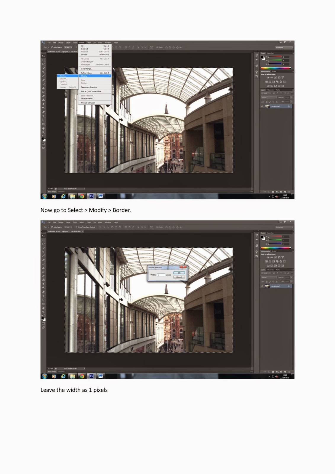
On the other hand, we were also creating some Panoramic, Hockney joiners and some texture and border images on Photoshop. I think they were okay and I tried to create multiple examples to show a range. I think the easiest was textures because the technique was pretty simple to follow. To sum it up, I also did colour popping, abstract, pinhole effect and solarisation which were all very effective. These tasks went by a breeze because I had multiple images to work with and it was great fun creating these images.
The darkroom side for experiments were also good. I managed to get various images using different techniques and focused on different effects. I think the best moment for the darkroom prints was to burn our images because it was very practical. It just gives a normal print a little push with some physical textures and distortion on the image.
After we had all tasks, I've also added some additional research that linked to architecture such as the converging verticals. This was just to address some of the issues that comes around with this sort of photography genre. I think it also helps me to understand the effect more and why it may have happened to me.
To sum this project up, there was a lot of key tasks and work we have produced that this evaluation could be endless. I can't describe enough how much we have learned and that we have definitely gone deep with this architecture photography. The communication side of the project also was well considered and I stuck to my ideas of creating old styled images and adding a scary effect because the two are totally different and it's amazing how we can create those sort of effects on the same image. I think this project has been an eye opener to a lot of techniques and experimentations than ever before because we were constantly working till we got better results. Also, there was a lot more considered ideas behind our work which we've never gone to depth with. I think this is reflected upon us because our images had to have a form of communication. I just hope that my ideas and communication effects are clear and I could just be proud of the amount of work I have created in this project.
Tuesday, 19 May 2015
Technical Folder


--------------------------------------------------------------------------------------------


--------------------------------------------------------------------------------------------


--------------------------------------------------------------------------------------------


--------------------------------------------------------------------------------------------

--------------------------------------------------------------------------------------------


Exhibition Research
 |
| Saatchi Gallery |
This is the well known Saatchi Gallery up in London. It is an open gallery however, sometimes they hold special exhibitions for newly presented projects. This gallery has so much open space and the images that are framed are all apart and spaced out nicely. This makes a gallery interesting because the work isn't cramped together and the empty space gives you the chance to roam and really take your time in looking at some pieces of work.
Powerpoint Presentation Slides


Overall, it was fun creating these powerpoint because it was the chance of putting our work together and seeing how much we've done throughout the project. I'm glad I didn't use too much text so it was brief in every slide. The presenting side of things also went well and it was a crazy experience.
Subscribe to:
Posts (Atom)