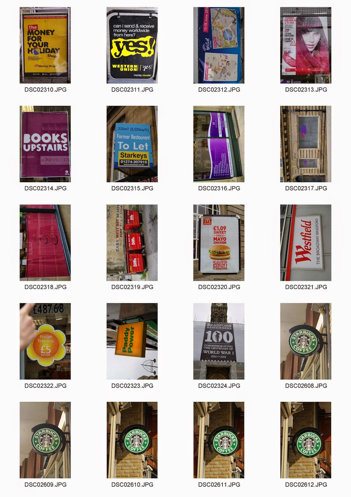
Task 1.2 - Signage Contact Sheets
Analysis
This image was based on signage and was particularly one of my favourites. It was taken during the day in town so it was composed with natural lighting. I like the composition of the image because the sign is right in the middle. The lighting and colours are very subtle, pale and smooth which works well with the green; making it the focal point. There is a small use of depth of field in the image along the brown far background. This ideally makes the sign stand out slightly dramatically. The image would be better if the metal on the right were taken out of the frame. However, it was a great image for my grid because of the square format; just on the sign.
This image is a contrast to the first. The colours are very vibrant and the tones are slightly dramatic from looking at the corner of the red bar. This was taken in natural light and the composition was fixed in the middle for the logo. I like this image particularly because of the background. It makes the centre look very bold.


No comments:
Post a Comment