Monday 6 October 2014

Thursday 2 October 2014

Final Evaluation


Final Evaluation

In the beginning, we were introduced to our unit based on colours. Then we looked deeper and focused on RGB and CMYK colours that we were working with. During that introduction to the unit, I learned how colours worked with our eyes and how light is a huge factor to consider. Then throughout the project, we were given tasks to complete such as to capture RGB and CMYK.

The first task was making moodboards. The first moodboard was on RGB and we had to college samples from magazines, extra bits of material and the internet. This was a simple task for me however; it was challenging to fill up the A3 page with images so I used pastels to fill the gaps and stuck on additional pictures. In this moodboard, I included my own images. Then we made a second moodboard for CMYK. This was a very challenging task because we had to get images from the library. I had to face problems with not finding some images on the internet so I had to find another image which was time consuming. However, once I got all the images, it was simple to make a digital moodboard. 
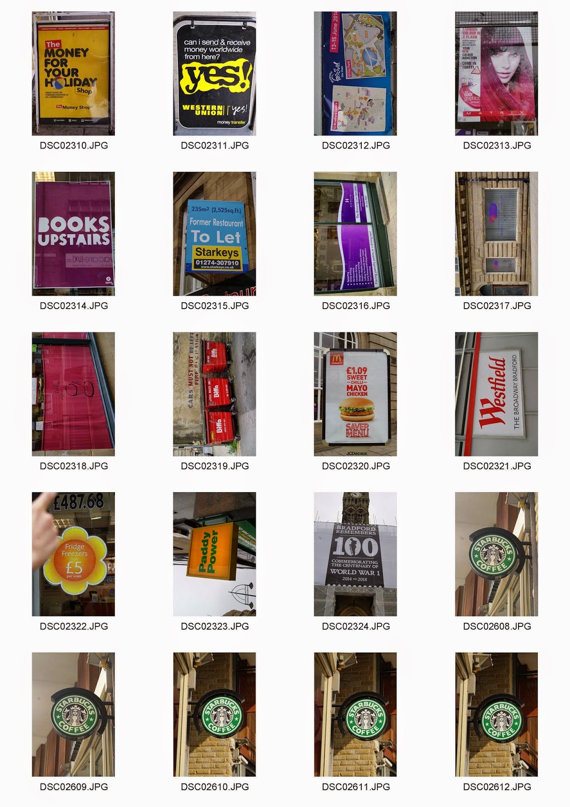
Furthermore, we had to take photos based upon publicity. At the first attempt, I took some images however I didn’t quite understand the subject. I had some images of signs however I wasn’t contempt with my images. So then after a while, I redone the shoot and got some more images which would work with my grid. My main intentions when taking images are composition. That is a reason as to why time is consumed really easily.

Second task was to capture images at the Saltaire trip. We had to capture images of the colours with the same subject. One of the issue I had was with time constrain, so after thinking what I could do, I just took images of colours I see rather than focusing on getting the same subject in each colour. The easiest to capture was the flowers. However, I didn’t want to capture different colour flowers the same way so I focused on using different techniques like depth of field and addressing composition in a unique manner. This seemed beneficial for my grids because I had 3 flower duotones which had different angles and focus. Overall, this trip was successful however the moment of time flew by too quick to really capture the best images.

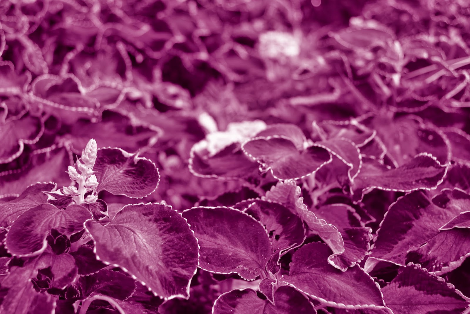
The third task was split in two halves. Firstly, we had to create duotones with the images we taken. To do this, we had to use Photoshop and change the image to a greyscale at first then select a colour for the duotone. This task taught me how to create a duotone which can be useful in the future. All my duotones were made rather quickly and there was no breaking 
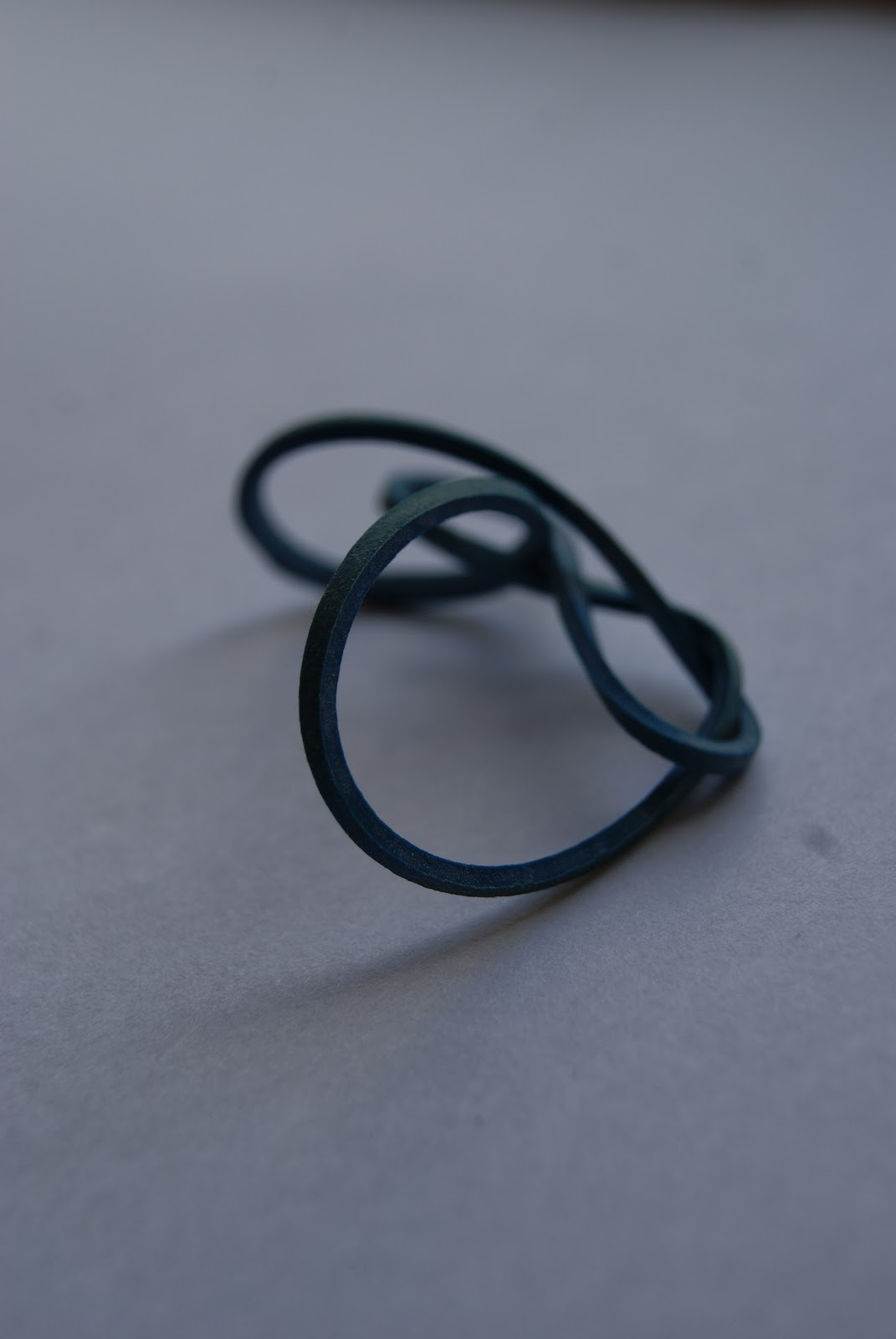
point in this task. Then we had a second task which was to take still life images of objects. This required me to collect some different colour objects and take close up photography. I think this task run smoothly because I managed to take some pictures of different colours individually. I think a minor problem was with my camera lenses, it would be hard to focus too closely so I had to zoom out till it focused.

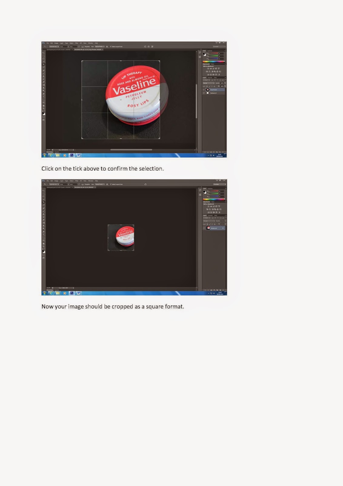
Last task was to create the colour grids. This was actually really fun just to fidget with the images and crop it for the chosen selection. We had to use Photoshop to crop the images with different height and weight for both RGB and CMYK grids. Then put all the images together on a new document. Changing the square format was the longest because it would consume time and cause confusion with the sizes. However, it was fairly simple and that was simple. I liked how we had to upload all the tasks to blogger rather than having visual diaries because it’s more efficient and it’s neater.

Overall, my time management was fairly good overly speaking because I managed to complete every task before the deadline. I learned that time management might be a struggle in these units of work we have to produce in the future, just on specific tasks so I need to plan to consume my time efficiently. All the technical work on Photoshop was simple for me and this unit did help me learn a few new outcomes such as duotones. I think this project was successful because I managed to create 2 photo grids and additional grids which all have different approaches of ideas. My images are focused on composition and it represents that quality is better than quantity. Next time I would try to focus more on quantity so I have a choice to choose images.

Task 4 - Colour Grids


Task 4 - Colour Grids
Here are my final grids. These were created on Photoshop and required all the images to be cropped into a square format. Then I adjusted the brightness and contrast to make the images look vibrant.


RGB Photogrid 1

This photo grid is based around RGB colours. In this grid, I included 3 duotones going diagonally based around flowers. Then I had each colour going across. The pictures chosen are intentionally from my signage images and from the still life shoots. I selected these images because of the colour choice & compositions.


CMYK Photogrid 1

This is my first CMYK photogrid. As again, my duotones are going diagonally across in order. And all other images going vertically. All my images are from my other task shoots. Personally I didn't like this because there was no specific subject and it was overloading. So then that inspired me to make another one and think out of the box.


CMYK Photogrid 2

Here is my second grid for CMYK. Personally, this is one of my favourites. After creating a first, I chose to make a grid just on my publicity shoot. Then I carefully cropped all the images intentionally just to show a tiny bit of the logo. This idea makes the grid look unique and the colours are all vividly shown in a unique order. Also set the brightness and contrast up to look more vibrant.


RGB Photogrid 2

This is my second photogrid for RGB. These images are themed around my publicity shoot on signs. The order is in a specific order so it's not simply going across. I chose the McDonalds sign in the middle because the red is the most strong focal point. So the viewer will focus in the middle then work their way out. Personally, I like my first RGB grid because the images are more in theme and it works better with the order.

Task 3.2 - Still Life Images


Task 3.2 - Still Life Images


Additional Images:


Analysis


DSC02491.JPG

This image is one of my favourite. One reason is because of its simplicity. The red is very vibrant and the background is simply black. There is a use of depth of field with the font on the lid. This was taken under artificial lighting; this is why there is a shadow present. The composition was intended to be far back rather than filling the frame because the task required us to crop the images in a square format so I tried taking it suitably far back.


DSC02467.JPG
This image is taken near a windowsill using natural lighting. I like this image because it’s a close up shot of a twisted elastic band. I placed the elastic on a piece of white sheet to capture a natural still life shot however; I think more lighting would make the image look better. There is also a shadow formed due to the direction of the lighting. I used depth of field by setting the lens on manual and making it focus on the front bit of the elastic band so it blurs out the back. The composition is also in the centre which makes it easier to crop into a square format for my grid.


Task 3.1 - Duotones


Task 3.1 - Duotones


These duotones were created on Photoshop with some level changes. 


Red.
This duotone is very subtle. I changed the levels to make the inner look darker so it grabs more attention that the outer image. This concept is for a focal point. Rather than having loads of details in the middle, I put a mid high contrast so it looks more bold.


Green.
This duotone has a slight dark shade of green so it looks as similar to the real picture. The levels were adjusted for the white details to be vivid on the leaves. There are different tones and shades on this picture however I like how the main focus is in the middle with the big leaf.


Blue.
I like this duotone because the focal point is right on the flower. The darkness makes it look bold and you can see this element of velvet on the details of the petals. There is this contrast from left to right with the background. The left side has more details on the flowers as if they were sticking out whereas the right side is overloaded with flowers.  


Cyan.

This duotone creates this cold mood. This picture was taken during a hot day in Saltaire however, creating this cyan duotone makes it seem like it was taken in the cold during winter. The background has this depth of field effect and the focus is in the middle.


Magenta.
This duotone is different to the others. The focus is from the bottom to the top. Saying that, the background which is blurred naturally shows the magenta overlay. There is different tones of magenta on the leaves which shows the texture in a closer detail.


Yellow.
This image has a yellow duotone that looks similar to a sepia effect. It makes the image look old. There is a nice exposure on the petals with the white details. I like the content on this image because the leaves are all the same and that compliments the flower to stand out.


Black.
This image is actually a greyscale. I like the details of the water and that contrasts with the mud. This image has an old element and the close up makes the image look fascinating. There are different tones of the black to create this muddy element.

Wednesday 1 October 2014

Task 2 - Soltaire Trip


Task 2 - Soltaire Trip


Analysis


This image is a close up of magenta flowers. This image was composed with natural lighting and manual focus to create this depth of field. I like this image because our focus drives towards the bottom left and the blurred yellow in the middle tells us what the focus is actually on. I like the way the depth of field makes us focus on the bottom to the top making it look interesting and bold along with the vibrant colours.


In this image, composition worked really well. I like how the flower is the centre and the use of depth of field is shown within the background; allow the focal point to be on the flower. The natural use of lighting makes the mood of this picture all jolly. There is a bright exposure on the petals because of the natural lighting. This makes it look effective because of the green stem in between.


Task 1.2 - Signage


Task 1.2 - Signage Contact Sheets


Analysis


This image was based on signage and was particularly one of my favourites. It was taken during the day in town so it was composed with natural lighting. I like the composition of the image because the sign is right in the middle. The lighting and colours are very subtle, pale and smooth which works well with the green; making it the focal point. There is a small use of depth of field in the image along the brown far background. This ideally makes the sign stand out slightly dramatically. The image would be better if the metal on the right were taken out of the frame. However, it was a great image for my grid because of the square format; just on the sign.


This image is a contrast to the first. The colours are very vibrant and the tones are slightly dramatic from looking at the corner of the red bar. This was taken in natural light and the composition was fixed in the middle for the logo. I like this image particularly because of the background. It makes the centre look very bold.


Task 1.1 - Moodboards

Task 1.1 - Moodboards

This moodboard is based around RGB colours. Once we received this task, we had to collect the images from magazines. I think this was kind of challenging but I managed to find some samples. After having examples from magazines, I explored looking for specific images around these colours on the internet which was easier. Once we had a collection of images to stick on, I stuck images all spaced out to fill this A3 page. However there was too many blanks so I took my moodboard home to colour it in with pastels. This was because the images from the internet were printed small. I also included my own images including some of the new college building for the green elements. Also samples from the argos catalogue and a drink label. I tried to make it look messily overloaded and vibrant.   


                                                    RGB Moodboard

______________________________________________________________


These moodboards are revolving around CMYK colours. The images are from photography and art books in the library. This different approach of getting images was really challenging. These are images of paintings and street art from different artists. I think this task required a lot of time as we had to find the images then search them on the internet. Once I collected all the images, I made a digital moodboard on powerpoint for each colour. Cyan was the most challenging because it was harder to find. Overall, I think these moodboards have worked well as different shades are displayed.


                                                 CMYK Moodboard