Research
Book Covers Analysis

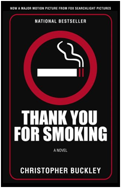
This book is called ‘Thank You for Smoking’ by Christopher Buckley. The image used is an animated cigarette with smoke leading out of it. The title is in a banner which doesn't work really well with the book cover as a title because the red box around it makes it look like a poster. The author’s name is big and bold and I don’t think it’s the best example of a book cover. However the animation does look rather real so therefore it does use good imagery. The layout can be better. The typography is okay to an extent, with the author’s name but that’s pretty much it.
Alternatively, this a better cover for the same book. The title is nice and clear. A lot more bold and recognisable compared to before. The typography is nice and professional with the use of red lines to surround this poster element. There is a sign use of a cigarette in the centre. The layout is pretty neat and slick. The author’s name is not so big and overpowering; in this case it’s on the bottom. This cover almost contradicts real life’s ‘not smoking signs’ with their own twist without the ‘not’.

This book cover uses really good imagery. The image is very thrilling and dramatic. It works really well with the title because it links with the glove with this thriller twist. The layout is pretty simple. The author’s name on the top and the title on the bottom. The typography on the title is very boring and bland. However, the white makes it stand out either way. In this case, the imagery is the best thing here, and the title doesn’t really look thrilling.
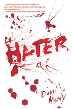
This book cover is really powerful. It is eye catchy and bold. The white cover is effective with the blood splatters. The title is also written with the blood effect which is called ‘Hater’ This itself is really a strong title, considering that it’s been written with the blood. The typography for the author’s name is also linking with the theme of thriller. It does make a good book cover because of all these different elements that are used to build this cover.

Here is another book cover that looks effective. It uses strong imagery of a blade in the centre. The typography is oval shaped that goes around the blade called ‘Sharp Objects’. The title does work along the imagery and the blade is engraved with the author’s name. The font used looks suitable to blades and has this ‘barbers’ effect. The black is the main background which is simple and contrasts with the imagery because the blade is shiny.

This book cover is really different. Apart from the title and author, there is no ratings like the other books. This book uses a low angle image looking upwards which is effective to the title of the book - ‘My sister’s grave’. The typography is almost overlapping the image. The font is pretty simple and does not give too much away about the genre. The imagery is very strong because it looks as if it’s been taken from a grave’s perspective. The colours are very vibrant in the centre and darker towards the trees.
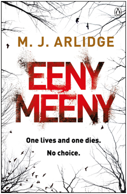
This cover is very eye-catching. The red contrasts with the black and white which makes it a good title. The typography is also very effective with this unique font. I like the layout with the title bang in the middle and the author above. The caption below does catch the audiences attention. Also, the title does work with the caption because eeny meeny is about ‘picking someone’; therefore the caption does link with someone having to die. The imagery is of tree branches coming out of corners. It is a silhouette effect which does make it look more mysterious. Overall, it’s a good cover because it fits the thriller category.
Typography
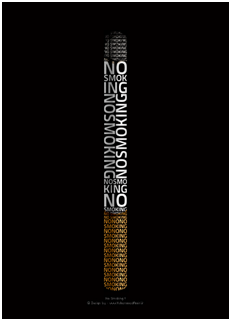
The typography in this is very creative. It is a cigarette made up of letters which say ‘no smoking’. This is very creative poster which is used for a no smoking ad. The colour of the typography changes from the brown to the white and they are all fitted vertically to look like a cigarette.

Here is another graphical work which state wash your hands. The imagery is really cool. It is covered with water and the quote is splashed in. This makes it look really abstract with the use of creativity. The details in the image are beyond intermediate. You can see the air bubbles and the typography is being washed away.

This poster uses typography in a cool way. The writing says I want Candy and the actual typography is made up of candy. The background is a nice neutral gradient and then you have all the candy which is multicoloured - all stand out.

This is a graphic design piece which says creative. The font is all edited and adjusted so it looks rather unique. Rather than having a simple font which says creative, this really does catch my eyes with it’s creativeness.
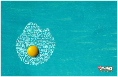
This is an ad for smarties. They use typography is a really creative manner. The image represents an egg and an actual smarties sweet looks as the egg yolk. I think this is really creative because the sweet really does look like yolk. The writing in white is in the shape of a fried egg.
No comments:
Post a Comment