Wednesday 5 November 2014

Tuesday 4 November 2014

Task 4b - Create and Evaluate

Short Evaluation

As i have mentioned roughly about these images in my mock up tasks, i shall extend my opinions on my outcome. 

Before i go on, this unit was challenging overall. I felt like i wasn't getting inspired by any of the images i saw from when these art movements have started evolving. I couldn't get my head around what cubism and futurism was and my head was blank for ideas. After a long time, i finally got a hang of it after looking into further details and writing up my contextual studies. And before i know it, i started to enjoy myself create such creative images. I have shown these experiments with different perspectives, typography and shown how much i have developed them forward. As we had to start the mock ups, i felt like it was a relief to see progress with the work I've been producing.

Time management in this unit was a struggle. It felt like time flew away and we had so many tasks to carry out within a week that it didn't help to produce work which had no ideas within them. I really enjoyed it when we made the handmade origami's. This was the time where we just had fun in doing something completely different that we wouldn't image to do. It was fun to explore some book covers that really stood out for us.

Next time, i would try and stay on track with some tasks. Some tasks in this unit was a pain because we'd require Photoshop so i had to do all the editing in class and do all the writing part at home in my own time. It was stressful towards the end but I tried the most i could have done in that period of time.

Overall, it's been a good, challenging project compared to the last one. I think the knowledge in this unit was more intense when we was introduced cubism and futurism, and then told to take pictures the week after - it was baffling. But i somehow managed to keep up and finish the project.


One of my finals is this image here. This typography is placed in the lower centre and it has this graphical structure that is aligned with the font so it looks like a invisible straight line/banner. The font is suitable and appropriate because it links to the image with this road concept and it has this 'motorbike tyres' element which can be linked to this image because the type of pathway is suited for motorbikes and pedestrians. The layers of pieces are also very simplistic and it overflows which makes it look third dimensional. The frames are also flipped horizontally and vertically to give this illusion. I would say this is more a modern style of cubism rather than an old style because it is very slick and fashionable to an extent. Overall, i can see this image being a book cover if it had an author and perhaps a rating.


This is also one of my book covers. I like how the image is repetitive with the yellow lines which links to my work on elements of design on pattern. The typography is in the middle and it's perspective is facing downwards. This is a contrast to the lines facing upwards. The font i chose like i've mentioned is the font used on every real road names. It is this UK road font and I thought this works well with the whole image. Also the yellow glow is to make it stand out slightly. I can see this book cover being a suitable cover for a book because it does demonstrate cubism and the typography is composed well. Overall, i'm happy with what i created in the last minute of the project.


This futurism cover shows the movements of this peacock with it's head. I think it could have been overworked and by duplicating the peacock more - it could have shown more movement all along to the left. However, i wanted it to be simple and composed well in the frame. The title is placed with a low opacity banner lower rather than the top because it's on top of the peacock so all attention will go on that spot.


This is an unseen book cover that I've made last minute. It uses this abstract water movement image, and has this modern element use of typography with this little graphical element. It is bang on the centre and aligned slightly to the left hand. The centre makes it stand out and also works well with the imagery because of the water fall right above it. This image is a suitable futurism image because it has this opacity element that shows these slight blurs like they did in my contextual studies.

Task 4a - Part II


Mock-Ups for Cubism


Here's my first mock up from the experiment image. I was testing how the font would work and look. So then i chose this font which looks like blocks because it suits cubism. The rectangle is a graphical experiment to make the font stand out, like a banner.


This is another experiment mock up. I did the same thing as before on this image and changed the font. This font looks very neat and organised and i picked it because of the same width and sharpness. It almost looks very third-dimensional too.


After making the first two, i felt like i can do better with typography. So then i created this mock up which uses this cool 'ink drip' font that links with the imagery. I think this looked more appropriate with the content and it gives it a slight push.


This is another experiment with the font change. This edition looks like paint stroke. It sort of works as this art book element, as the imagery is of pens with the use of cubist elements within the picture.


This mock up is made of one of my images that i like. The typography is very much linked to 'roads' because it is the font of road names. I also added an outer glow with the yellow touch to match the yellow road lines. Then distorted the text to give it this push from a different perspective. This is because the yellow road lines are heading upwards so the font is heading downwards. I placed the font in the middle because it is eye catching however I will also experiment with that.


Font Used


This is the same image, however the font is on the bottom. This gives the imagery some power because the audience's attention will not only focus on the title, but on the image itself. Which is a great cubist image.


On the other hand, this mock up is more about simplicity. The typography represents the road life and the image is a cubist image of a pathway all distorted around the centre. I think the layers of pieces work well as a cubist image however, the opacity needs to be changed and then it would stand out more.


This is ultimately the best image in my opinion. I really like this simplicity element which does represent cubism. I changed the opacity on the layers of pieces and made it more overlapping. Now it stands out more and works better as a cubist image. I also changed the typography by changing the font colour to white so it's nice and bold. I added a graphical element on the left side to give it this invisible line which engages with our eyes. This line does align with the font so it looks slick. Personally, i think it worked well with the idea.


Mock-Ups for Futurism


This was the first mock up I did for futurism, The font was just a simple font going vertically with a rectangle banner behind it so the font can stand out. After creating this, i felt the need to make one with a better typography.


This mock up is the same as previously however I changed the typography with this 'water waves' font. I like how the typography is actually vertical rather than simply horizontal. It also works well with the image because the duck is on the right side. I think the typography being vertical actually suits this nature theme. This suited the content in my opinion, however it can be changed with multiple fonts that can be duplicated to show movement. I decided that the imagery would represent the futurism and the font will be simple yet unique.


This is one of my favourite mock up. The image is a well suited futuristic image that shows the peacocks movements and then you have the typography. This typography is all 'flowery embroidered' which links with the theme of nature. I added the banner behind and a glow for the font to be easy to read and attract the audience as a book cover.


Experiment with Peacock Duplicates
Removed Background


This was a last minute, random mock up. I kept all the typography the same and experimented with the background. I chose one of my images from my elements of designs which was for leading lines and added this peacock which shows movements - perfect for a futuristic image.

Task 4a - Part I

Research

Book Covers Analysis


This book is called ‘Thank You for Smoking’ by Christopher Buckley. The image used is an animated cigarette with smoke leading out of it. The title is in a banner which doesn't work really well with the book cover as a title because the red box around it makes it look like a poster. The author’s name is big and bold and I don’t think it’s the best example of a book cover. However the animation does look rather real so therefore it does use good imagery. The layout can be better. The typography is okay to an extent, with the author’s name but that’s pretty much it.


Alternatively, this a better cover for the same book. The title is nice and clear. A lot more bold and recognisable compared to before. The typography is nice and professional with the use of red lines to surround this poster element. There is a sign use of a cigarette in the centre. The layout is pretty neat and slick. The author’s name is not so big and overpowering; in this case it’s on the bottom. This cover almost contradicts real life’s ‘not smoking signs’ with their own twist without the ‘not’.


This book cover uses really good imagery. The image is very thrilling and dramatic. It works really well with the title because it links with the glove with this thriller twist. The layout is pretty simple. The author’s name on the top and the title on the bottom. The typography on the title is very boring and bland. However, the white makes it stand out either way. In this case, the imagery is the best thing here, and the title doesn’t really look thrilling.


This book cover is really powerful. It is eye catchy and bold. The white cover is effective with the blood splatters. The title is also written with the blood effect which is called ‘Hater’ This itself is really a strong title, considering that it’s been written with the blood. The typography for the author’s name is also linking with the theme of thriller. It does make a good book cover because of all these different elements that are used to build this cover.


Here is another book cover that looks effective. It uses strong imagery of a blade in the centre. The typography is oval shaped that goes around the blade called ‘Sharp Objects’. The title does work along the imagery and the blade is engraved with the author’s name. The font used looks suitable to blades and has this ‘barbers’ effect. The black is the main background which is simple and contrasts with the imagery because the blade is shiny.


This book cover is really different. Apart from the title and author, there is no ratings like the other books. This book uses a low angle image looking upwards which is effective to the title of the book - ‘My sister’s grave’. The typography is almost overlapping the image. The font is pretty simple and does not give too much away about the genre. The imagery is very strong because it looks as if it’s been taken from a grave’s perspective. The colours are very vibrant in the centre and darker towards the trees.


This cover is very eye-catching. The red contrasts with the black and white which makes it a good title. The typography is also very effective with this unique font. I like the layout with the title bang in the middle and the author above. The caption below does catch the audiences attention. Also, the title does work with the caption because eeny meeny is about ‘picking someone’; therefore the caption does link with someone having to die. The imagery is of tree branches coming out of corners. It is a silhouette effect which does make it look more mysterious. Overall, it’s a good cover because it fits the thriller category.


Typography


The typography in this is very creative. It is a cigarette made up of letters which say ‘no smoking’. This is very creative poster which is used for a no smoking ad. The colour of the typography changes from the brown to the white and they are all fitted vertically to look like a cigarette.


Here is another graphical work which state wash your hands. The imagery is really cool. It is covered with water and the quote is splashed in. This makes it look really abstract with the use of creativity. The details in the image are beyond intermediate. You can see the air bubbles and the typography is being washed away.


This poster uses typography in a cool way. The writing says I want Candy and the actual typography is made up of candy. The background is a nice neutral gradient and then you have all the candy which is multicoloured - all stand out.


This is a graphic design piece which says creative. The font is all edited and adjusted so it looks rather unique. Rather than having a simple font which says creative, this really does catch my eyes with it’s creativeness.


This is an ad for smarties. They use typography is a really creative manner. The image represents an egg and an actual smarties sweet looks as the egg yolk. I think this is really creative because the sweet really does look like yolk. The writing in white is in the shape of a fried egg.


Task 1a - Elements of Design


Elements of Design

Elements of design are factors which make up an image. These factors are taken into consideration. The four I have selected are: colour, lines, pattern and texture.

Colour Moodboard

The first moodboard is based on colours. These images consist of having bright and vibrant colours which stand out among the picture. Along working with other elements, colours is one of the main element which livens up images because it is very eye catching. It creates several moods and emotions. Colour is in fact so significant that without it, it would be a complete different world. 

Line Moodboard
This moodboard is focused on lines. I like these images because it demonstrates how line is the main element due to the way it's been composed. Some images look as though you're directly walking along the path they shot. The colours on these images are very muted and makes the images look very interesting; it creates this dark, grunge mood.

Pattern Moodboard
This moodboard consists images revolving pattern. I selected these images because it demonstrates that pattern is very subliminal to the human eye. It can be around anywhere and it can be a challenge to notice some similarities in the order of the structure. The images are very urban and revolve around everyday life pattern which will help me evolve from these images into ideas.

Texture Moodboard
This moodboard is focusing on texture. There are examples here from the internet and library of different object and their textures. I think texture is a very different element in images. It is mostly based on close up shots which make the object seem surreal or magnificent. Pattern and texture are very similar and can both work together in most cases. 


Own Images - Contact Sheets


Analysis

Colour Element
This image is for the colour element of design. I like how the background is neutral and the colours seem to stand out. The focus is clear, and does have a touch of depth of field within the close lid. The blue centre lid has the main focus so the composition seems to have worked well with everything in the frame.

Lines Element
This image portrays leading lines. The lines are from the radiator in this image. You can see the line continue out of the frame. There is a use of depth of field, which focuses in the centre and blurs out. The composition is well fixed with the lines and the focal point going across vertically.

Pattern Element
This image portrays pattern. The bricks are repetitive and the composition is fixed straight across horizontally. The colours in this image look pretty muted and there is a lot of detail showed within the gaps. This image would also work well with the texture element because it's a close up and there is a rough texture.

Texture Element
This image is focusing on texture. The subject is grass and some excess leaves and twigs. These excess things make the texture look rough. The colour is bold and bright, which makes the texture stand out. There is a mess in the grass so it looks all scruffy.


Task 3 - Experiment

Part 1:

Cubist image by hand


Rabbit Origami

I have created a rabbit origami out of my picture. My picture was originally autumn leaves, and i chose a rabbit shape because they eat leaves and it links with nature. The technique was followed through a youtube tutorial. I think this works well with cubist art because of the concept of making a 2D object which is my picture - look 3D.  
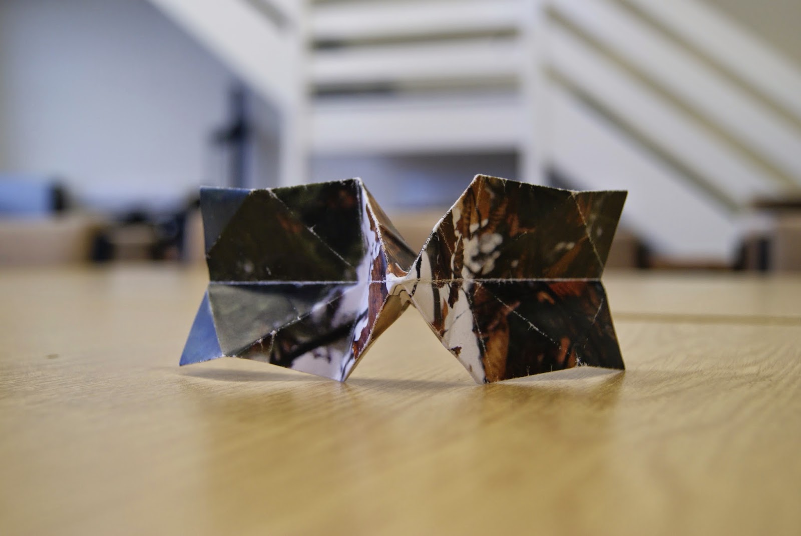

Bow-tie Origami

This is an origami bow-tie out of my picture. The image was of a tree with dangling leaves falling. This links to cubist art because of the 3D creation and this different perspective element. The shape of the origami sticks out in the middle which distorts the image look as another perspective.

Leaf Origami

This origami is in the shape of a leaf. The image I chose is a close up of the leave's lines and textures which works well with the shape of a leaf. The perspective of the image makes this origami look like a cubist art work because it shows a birds eye view.


Part 2

Cubist image using Photoshop

First Attempt - Experiment

This cubist image was created on Photoshop. The box around the squirrel is the darkest out the rest so it can stand out the most. The rest of the image is selected in squares which makes it look slightly third-dimensional. 


Second Attempt - Experiment

This image is the same image as above. However, I looked at some examples and from my contextual studies to make it look somewhat creative. The tree looks distorted and the squirrel looks as it's walking along diagonally. 

Second Picture
This image is one of my favourite. Reason why is because the leaf in the middle is warped to the left giving it this different perspective. This makes a good cubist image because the squares overlaps with the other squares which makes it look 3D. The focus on this image itself is very much on the centre leaf, this makes it look eye grabbing.

Last minute edits


This image is very simplistic and still fits as a cubist image. There are overlays and two of the layers of pieces are flipped vertically and horizontally. I like this image because it's not overworked through the whole image, it's just a section in the middle.


This image is similar to the top but it's more overworked and the yellow lines add a new content. I like this image because of the way all the pieces are arranged everywhere and it's from the same image. It fits a cubist image because it's overlapping and it looks surreal.


This image is a good example of a cubist image because it has a unique perspective from left to right. There are sections from the image that are rearranged to give it this muddled look. All the squares are impact so it works with the outer bit of the image.


Part 3

Futurism image using Photoshop


Waterfall Movements
This image consisted two images of waterfalls movements at different shutter speed. One was at a very fast shutter speed to capture the water freeze and the other was a slow shutter speed to capture this cloudy image. Then using Photoshop, I put both images overlaid and changed the opacity to give this element of movement.


'People' Experiment
This image was just a random image taken on my photoshoot trip. This is also two images placed over each other then I erased the background and some elements to just make this movement present on the guy or the left and the guy on the right taking pictures. This gives an illusion that those two men are moving and not just everything in the image because the two images are alike. 

Squirrel Experiment
In this image, I used the same image twice set on overlay. Then re-adjusted one above so it looks as though the squirrel is moving up. I didn't like that the tree and the grass was also blurred so I'm going to do another experiment to see how I can just make the squirrel look in motion.

Squirrel Experiment 2
This outcome was better. I duplicated the background then erased the background around the squirrel. Then I just placed the layer onto the original background and duplicated the squirrel so there's an additional 2 squirrels. Then changed the opacity and adjusted it to make it look like it's moving. 


This experiment was 2 similar images with the use of overlay and opacity and adjustment changes.

Some more examples: